Thursday, February 28, 2019

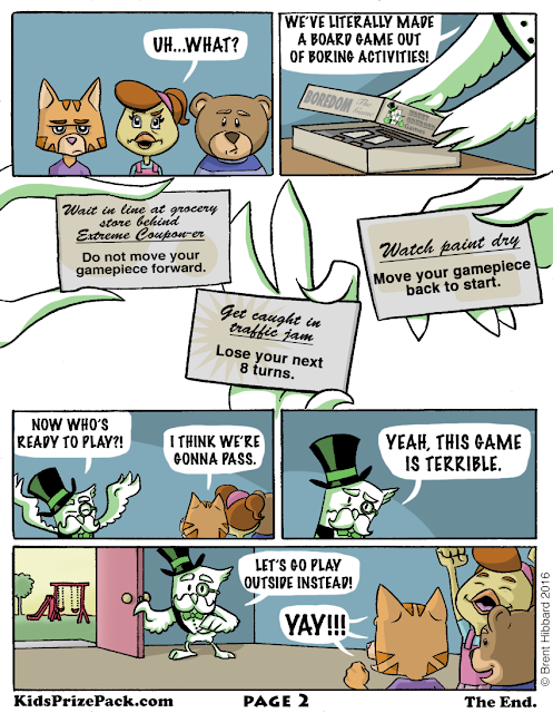
KPP - Bored Game


I'll be honest with you: The idea for this comic came directly from "Bored" being a homophone for "Board". Look, as a creative person, you're not always proud of where an idea came from, but it is what it is. That said, this might be one of my favorite KPP comics that I've made. I was VERY happy with Mr. Moneygrubber's character design. He's like an owl version of Uncle Pennybags from the board game, Monopoly. Why an owl? I think I wanted to pick an animal that might appear old & wise, but could also be fun to draw.

This is the first time I've illustrated a character that was white in color, but used a single color (green) to shade them. I think it actually turned out pretty well. It's likely that having a cartoonier art style helped make this work, too.

And while I tried to make the character designs (including making the kids animals because I wanted to draw something other than humans) fun, I really went pretty basic on designing the board game graphics. I mean, when the game itself is called 'Boredom: The Game', you really gotta tone things down. Thus, dull browns & grays were used, along with black text on the game cards (though I did have 2 different fonts on the cards - one for what the in-game character was doing & one for the consequence of doing that activity).

Overall, there was some fun experimentation on this comic, but I still tried to keep it fun & humorous. Hope you dig it!

-Brent


Tuesday, September 19, 2017

KPP - The Challenge

When the Fantasy theme came around, I knew this comic would focus on some type of warrior, stepping up to vanquish their foe, but I purposely stayed away from making our hero male because the leads of all of my other comics had been males (except maybe the butterfly?) and I wanted to represent women as being strong, too. Check out the comic below:


I can't remember why I decided to name her Cornelia, but I recall naming her tribe The Ghastro after the gastrointestinal system of our bodies, which has to do with the stomach. This comes into play on Page 2 where she easily gulps down the giant steak without issue. Foreshadowing!

I played with the lettering a bit with this one, making Cornelia's dialogue look more regal, whereas the Dragon's dialogue looks a bit rough and is red because...his words are hot? I don't know, maybe I just thought it'd look cool.

I really don't have any clue what I'm doing , you guys.

But one thing I DO KNOW, it that I love dinosaurs, and dragons are like fantasy dinosaurs, so this was a ton of fun for me to make!

I also used these 2 pages as part of an entry for a Breaking Into Comics contest through Darby Pop publishing, and was one of the winners. It was the first time I've ever worked with an actual comics publisher, so thanks Cornelia!


KPP - The Ride


With the newest Star Wars film coming out at the time ("The Force Awakens"), we at Kids Prize Pack wanted to focus on the outer space/cosmic side of things, so naturally, I decided to do a story featuring aliens.


I went through many, many, MANY designs for the aliens and finally landed on the designs you see in the comic above. One of my favorite things is that the aliens, like people, have different skin tones and facial features, but they're still recognizable as aliens. For the color palette, since the aliens are in the green spectrum, I wanted to focus on the other side of the color wheel for the backgrounds, using much warmer reds & purples.

Oh, and I hate drawing vehicles, but when you make comics, it's necessary to include them at times. That said, I'm super happy with how the Hover Rover turned out!


KPP - A (Soon To Be) Mad World


For this Mad Science theme, I decided to create my own mad scientist character called The Mad Professor and also designed an Igor-like sidekick for him named Mortimer. Check them out below:


I ended up liking these characters quite a bit and would bring them back for later KPP comics. This is also the first time I used rounded rectangles for the word balloon shapes. They're not great, but they work for the style I'm going for (and I still use them to this day).


Magnet Design

Thursday, March 17, 2016

KPP - Trick Or Treat


The October theme for Kids Prize Pack was "Monsters & Ghouls". Naturally, I made a Halloween themed comic for that month. Here it is:


This is the first comic that I've made with dialogue, which meant that I had to figure out how to Letter (not that the Lettering is good, but it's serviceable). I don't remember how I came up with the idea for this comic, but I do recall that the coloring took FOREVER. I've since figured out a way to make the coloring slightly less time consuming, but I'd still love to be able to be faster. I also remember thinking that the second to last panel on Page 2 (where the goblin pulls off his mask) might be a little too creepy looking...but I still used it. Because I am a champion.

Below are the theme & magnet designs. They prominently feature the goblin, which I was worried might give away the  reveal on Page 2 of the comic, but again, I am a champion and used it anyway.


Here's the original sketch design for the Goblin that I did in my notebook. I don't know what I had him dressed in a polo shirt. Probably because having a naked goblin in your sketchbook would be weird.


Here's some sketch ideas for the magnet. Originally I was going to have him eating a bowl of candy, but I liked the idea of him eating a Jack O'Lantern better.


Thumbnail sketch of Pages 1 & 2 for storytelling purposes, plus a quick design of the goblin's mask.

 
Page 1 Inks.

Page 2 Inks.

Magnet/Theme Inks.
That's it for this one. I'll try to have the next one ready for you soon!

-Brent

Thursday, January 14, 2016

KPP - The Lion & The Butterfly


So here's a post about the first comic that I made for Kids Prize Pack. A couple of quick notes before we delve in:

-My generous partners over at Kids Prize Pack hooked me up with Photoshop (thanks, guys!), which I had never used before, so you'll probably (hopefully!) see me work out the kinks as I go along here. 

-Also, I design a magnet that fits the theme of each month, so I'll include that in these posts as well. Speaking of which...
Our September theme was "Into The Wild", which had a focus on animals. One of the first things I drew for this theme was the image of the lion & butterfly that you see above. I liked it enough that I figured I would use them in my first two-page comic. (Since doing this, I've stuck with that idea, making each magnet reflect a character from that month's comic.) But enough yapping, here's the comic itself:


There you go, my first comic made entirely by me! It's clearly not high-art, but I had fun figuring the process out, from writing to drawing to coloring. Since I had zero experience with using Photoshop as an art tool, I knew there would be a learning curve involved, so I tried to make things as easy for myself as I could. For example, I knew I wanted the story to be silent (meaning no text or word balloons). I instead leaned on visual storytelling to help move the story along. (At least, that's what I hope happened!) I really enjoy drawing characters who can emote or "act", so even though it was a bit challenging, it was still fun. 

There are a couple of specific things that I wanted to accomplish with this comic:

1. The lion would go through a few different emotional changes (asleep/neutral to happy on Page 1, and then from happy to scared/surprised to sad and finally back to happy on Page 2). It was important to me that each reaction came across clearly since there would be no dialogue and the only character that can show emotion between the two is the lion. I think I did alright on this one.

2. I really wanted this to have an animated look to it, so I decided early on that only the two characters would have black outlines, with all of the backgrounds having a painted look to them. I decided the best way to do this was to fully pencil the pages, scan them to Photoshop and do the rest (inking and coloring) digitally. In hind-sight, there's probably a better way to do it, but what can you do...

So yeah, there's my first KPP comic. Hope you liked it! More are on the way, but until then, here's some more art for you to look at:

Magnet Design

Page 1 Pencils

Page 2 Pencils


Final Inks for the theme/magnet art (this was drawn on actual paper, then colored in Photoshop). I also adjusted the lion's head digitally to make it appear like he's looking at the butterfly.


Quick character design sketches. I eventually decided to use the upper right-hand design for the magnet & theme illustration.


Upper left & upper right: Layouts for the two-page comic with annotations for what should happen in each panel.
Bottom left: A quick sketch of the lion playing with the Butterfly
Bottom right: A quick sketch idea that popped in my mind when I was laying out the comic. I would later use this for Page 2, Panel 6 of the final comic.


That's it for now! I'll have a new comic for you soon, but in the meantime, check out KidsPrizePack.com, won't you? And be sure to follow me on Twitter and Instagram (@BrentHibbard)!

-BH.


Monday, January 4, 2016

Kids Prize Pack: The Journey Begins...

So it has been exactly one year since my last post, and good lord, have things changed! To give you a quick rundown:

I was contacted by an old classmate of mine (Hi, Dusty!) back in May of 2015 about a subscription box company that he was starting up with a couple of people (Hi, Casey & David!) and he asked if I would do some artwork for him. It would be a monthly box for kids, filled with books, toys and games with a changing monthly theme that will focus on literacy (the idea being that the kids will love the toys and games so much, they'll want to dive into books of the same theme). Artwork for kids seemed like a good fit for the type of stuff I like to draw, so I took him up on the offer. And what started out as a small drawing here and there has snowballed into essentially a second job for me, which I'm very grateful for as it gives me an outlet for my artwork. The name of the company is Kids Prize Pack and you can find out more about them us at KidsPrizePack.com. I've since taken the role of Director of Creativity for KPP which means I get to work on a lot of fun, creative stuff. Yay!

This post is going to be a bunch of artwork I've done for the company/website. Because why not. I made this stuff so YOU'RE GONNA LOOK AT IT.

First thing's first: I did not design this logo (they already had that by the time I came on board) so I won't take credit for it. Sometimes I'll recolor it for things, but that's pretty much it.
Moving on, here's some stuff that I actually made!


Let's talk about boxes! Have you ever tried to design a box before? DON'T! It's a nightmare! There's way more involved in smashing ink into a piece of cardboard than I ever could have imagined and I found out the hard way.

Here's my initial design for what the boxes would look like. I didn't know what size or shape the boxes would be or even how they would fold together, so this was my best guess. It was decided early on that there would be a Boys box and a Girls box, which I've drawn here:


I knew I wanted to blend the associated colors for each gender (Blue for Boys & Pink for Girls) with another so they would look different, but still recognizable as being from the same company. I went with white because it's gender neutral and would pop if you were coming home from work or school and saw the box on your front porch.

Eventually we got the appropriate box dimensions and whatnot to set forth on the long, arduous task of properly designing what would become the final box art. The logo would be converted to a simple two-color rendering and links to our website, Facebook and Twitter would be added. Here's the final flat version of the box art that I came up with:

And here's what the actual physical boxes look like:


It was pretty surreal the first time I saw them. To have something that was initially just a quick drawing in my art pad become a real, tangible thing is pretty neat. Also, the next time you look at a pizza box or a box from your favorite online retailer, keep in mind that someone went to great pains to birth it into reality. To craft it into a work of art that also happens to temporarily house food or items. But then throw it away because, come on, it's just a box!

As for illustrations for the website, here's a background that I made:


Illustrations for the 3-Step Process of how KPP works:

Step 1:


Step 2:


Step 3:


Some simple designs for the various age/gender options:

Boys 4-8
 Girls 4-8
 Boys 9-12
 Girls 9-12

And finally, an illustration for our homepage:

That's gonna be it for now, but stay tuned because in each month's box, we include a magnet design and two-page story by me, which I'll be posting to this blog as well. In the meantime, check out KidsPrizePack.com, look up KPP unboxing videos on YouTube and tell your friends about us!

-Brent