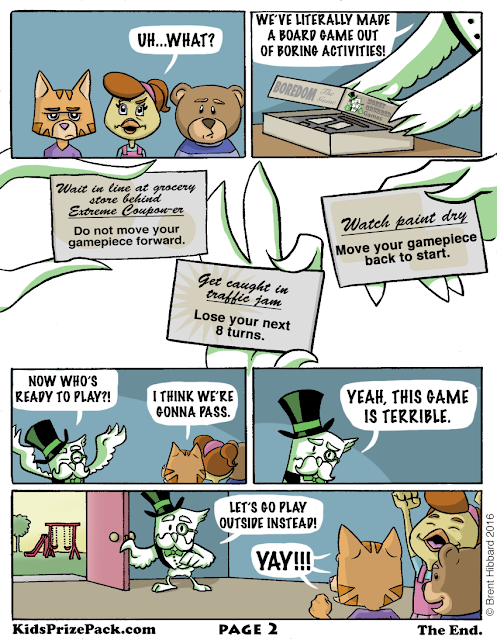
I'll be honest with you: The idea for this comic came directly from "Bored" being a homophone for "Board". Look, as a creative person, you're not always proud of where an idea came from, but it is what it is. That said, this might be one of my favorite KPP comics that I've made. I was VERY happy with Mr. Moneygrubber's character design. He's like an owl version of Uncle Pennybags from the board game, Monopoly. Why an owl? I think I wanted to pick an animal that might appear old & wise, but could also be fun to draw.
This is the first time I've illustrated a character that was white in color, but used a single color (green) to shade them. I think it actually turned out pretty well. It's likely that having a cartoonier art style helped make this work, too.
And while I tried to make the character designs (including making the kids animals because I wanted to draw something other than humans) fun, I really went pretty basic on designing the board game graphics. I mean, when the game itself is called 'Boredom: The Game', you really gotta tone things down. Thus, dull browns & grays were used, along with black text on the game cards (though I did have 2 different fonts on the cards - one for what the in-game character was doing & one for the consequence of doing that activity).
Overall, there was some fun experimentation on this comic, but I still tried to keep it fun & humorous. Hope you dig it!
-Brent


No comments:
Post a Comment